Wxsmith tutorial: Working with items
Warning: Unfinished
Working with items
Hi. In the previous tutorial we learned how to create some small application using wxWidgets. We created window with few items inside. In this tutorial we will focus on wxWidgets items which form the resource. I'll show how you can add items into resource, how to change them, finally I'll describe few most important and most usefull items.
Note that all screenshoots presented here were made on Linux but they shoul not be very different from the windows ones.
Ok, let's start.
Create new application
We will start with empty wxWidgets project as our blackboard. Steps required to do this were described in previous tutorial so if you have any problems you can look into it.
Let's select File->New->Project menu, and choose wxWidgets application there. When you're in the wizard, make sure that "Preffered GUI Builder" is set to wxSmith and "Application type" is set to "Frame Based".
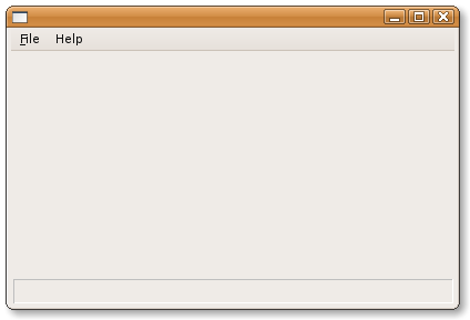
After the wizard generates project you should be able to compile and run it. The application should look like this:
Working with items
Each resource in wxSmith is made of items. All your buttons, text boxes, lists etc are items. Also some more abstract things like sizers, spacers (used to add empty space), menu items or even timers are also items. So basically anything that's inside the resource may be called item. I'll also use term component since it reflects the valid meaning too.
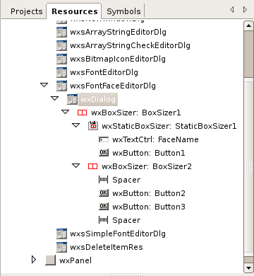
Actually each resource has one root item: for wxDialog it would be wxDialog item, for wxFrame it would be wxFrame item and simillarily for wxFrame it would be wxFrame item. If you walked through previous tutorial you probably noticed that some items may have children - for example you insert sub-menus into menus, some items into sizers and so on. Those items may also have their children. This form structure of tree which is directly represented inside resource browser:
In the picture above, you may see example of such tree. wxFontFaceEditorDlg is opened resource with root node of type wxDialog. We can see that this resource consists of few sizers, few buttons, one text area and some spacers. It's definitely and easy resource. For more complicated resources, there could be more than 100 items and tree browser may be helpful when locating them inside the editor.
Each item has it's properties - these are usually some values which describe the item. Some of them may affect the way item looks, some may change item's behavior, some may be dedicated to programming facilities. You will also find that there is set of properties available in almost every item - that's correct since many properties are generic ones like position and size.
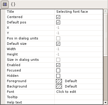
wxSmith allow to edit items inside properties browser (the window which is usually under the resource browser). If you select item either by selecting it on resource browser or by clicking on it inside editor, properties editor switches to edit it's properties. Here's an example of the property browser:
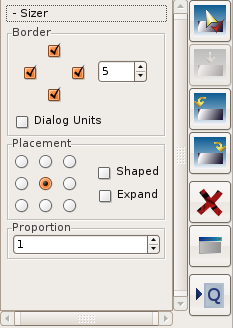
You can also use Quick-Properties panel available after pressing the "Q" button on the right side of the editor:
The purpose of this panel is to provide most common properties in user-friendly way. Unfortunately it's rarely used and you will probably fid it usefull only while adjusting sizer-related settings.
The last and the easiest one is to operate directly on item inside editor - you can grab drag boxes and change item's size. You can also move item into another position by simply grabbing item somewhere on it and drag to another place.
Excercise: playing with items
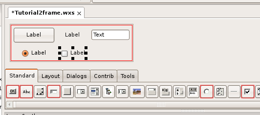
Ok, let's do some excercise. We started with empty window. First let's add wxFlexGridSizer into it - it's located in Layout pallete (you can find informations on how to add items in previous tutorial). Now let's add following items into it adding each one after the previous one: wxButton, wxStaticText, wxRadioButton and wxCheckBox. The result should look like this:
Added items are selected with light red border - all can be found on Standard palette.
Now as we have our playground, let's change some items. First thing we will do is to change label and colour of the button. To do this let's click on it and move to properties window.
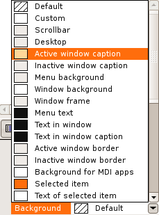
Label is the first property and it's quite easy to change - you can do it by clicking on the "Label" on the right and just typing new text. Colour is little bit harder to find. Usually items have two colours - Background and Foreground colour. Background, as the name says, is used to fill item's background, Foreground on the other hand is used to paint some content onto background. Note that there's no strict interpretation of these colours so you should experiment to find out their meaning. In button, Background is what we need. So let's find Background property - it's value can be changed by using combobox:
On the list you may find set of predefined system colours. When you choose one of them, they will be read from current system settings making you application compatible with system theme. There are also two special entries - Default (which means that we don not want to set out colour) and Custom. When you select Custom, wxSmith will open colour dialog where you can choose any colour you want. I have choosen light green and here's the result:
There are also other properties we could talk about, but the best way to learn them is to play with them, so I leave the discoveries to you :)
Now let's use a mouse.
Selected item have eight black boxes around it - these boxes can be used to change size of item. You will easily notice when you will drag the black box because mouse cursor changes when is over such box. So let's resize the wxTextCtrl (edit box):
You may see that resizing item will also change properties in browser - Default size is unchecked now and Width and Height is set to required values. There's also other property which seems to be untouched - "Size in Dialog Units", which is also related to size. Ususally when you must specify size you ste it in pixels. Alternatively these values may be represented in "Dialog Units". Dialog Unit is usually little bit bigger than one pixel and it's size depends of current font's size (actually it's size of font of some parent of the item which does have font). This is usefull when you want such values to be proportional to text presented on window. wxSmith will take care of this settings so you can resize items using dialog units directly inside editor.
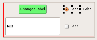
Now let's change position of radio box. Ok, but I've said that sizer is responsible for the positioning - that's right. We have limited possibilities to change position - inside one sizer we can only reorder items, for more complex resources we can also move item between two sizers and other areas where sizers do not apply. Ok, back to our example, let's move the radio box to be right after the button. To do this click on the radio button and drag it onto button. When you start dragging you will notice that the area of sizer changed to darg blue - this is a helper to show you what will be the new parent of dragged item. When you move cursor onto button, half of it will become light-blue. This helper shows where new item will be placed - when the left half of pointed item is highlighted, dragged item will be added before it. When the right half is hightlighted, dragged item will be added after it. And when there's no highlighted item, new item will be added at the end of the parent:
When you drop the item, it will change it's position. Note that all items after new position also moved - that's because default settings of wxFlexGridSizer allow only 3 items in one row (this can be changed in property browser) so items just adopted to new order:
Ok, now let's learn a little bit about items available in wxSmith. I'll describe all supported sizers and few important components from Standard palette. Let's start with sizers.
Few words about available sizers
Currently we know that sizers are responsible for automatically setting position and size of some components. But how they do that? Well it depends on which sizer has been used, what are the rules? The genric rule is that sizer tries to use all it's available space and place managed components in such way that they do not overlap. If the area available to sizer is to small, it requests bigger area so you can be sure that all components won't get out of the window (unfortunately you can not be sure that after such adjustments the window will be small enough to fit on the screen so be careful with that). Another rule which should be mentioned here is that sizers automatically set-up the minimum size required by the window. Basically when you edit window using sizers, you should know that you edit the smallest layout and without some tricks, you won't be able to resize window to something smaller.
Here's list of all sizers available in wxSmith:
wxBoxSizer
wxBoxSizer is the most basic sizer available in wxWidgets. It's purpose is to align components in one line - one next to another - either horizontally or vertically. This sizer also tries to keep some proortions between components - for horizontal sizer you can set factors which will keep proportionality of widths and the height of the sizer area will be equal to height of the tallest component. Analogically, vertical sizers keep heights proportional and the width will be taken the widest component.
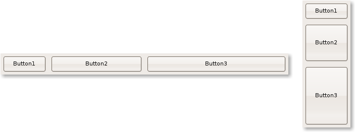
Here are examples of layout using box sizers (the first one is the horizontal one, the second is vertical one):
In that example you may see that all components have same width and height.
But let's assume that we want the Button2 to be 2 times wider that Button1 and Button3 to be 3 times wider than Button1. This can be easily done by using the Proportion property of managed components. By default the value of all components is set to 1 so they have equal size. Changing the Proportion of second button to 2 would mean that it should be 2 times wider that the first or third one.
Genreally you can set any value you want here. One of common techniques is to set percentage value - for example setting proportions to values 20, 30 and 50 would mean that the first button should occupy 20% of the space, the second one 30% and the third one 50%. The special value 0 means that this item should be skipped in proportion calculations and it will won't automatically adjust it's size when main window is resized.
So if we want to get 1:2:3 proportions, we set 1 for Button1, 2 for Button2 and 3 for Button3. And here is the result:
Also note that if you create resizable window and resize it, those 3 buttons will automatically grow and keep proportions (when you set Proportion to 0, such item won't grow).
The other dimension which is not controlled by Proportion property may be controlled using "Expand" and "Shaped" properties. They are simple checkbockses. If you check the first one, the item will expand it's width/height and will get the size of the biggest item managed by the same sizer. Selecting "Shaped" will also make the item resize but such item will try to keep the initial proportion between width and height so it don't have to use all available space. The effect of "Expand" and "Shaped" properties can be seen when items differ in width/height, here's the example:
In this examples, the first button is the one that has the biggest size of all three buttons. It's size will be used to adjust sizes of other buttons. The second one has "Expand" flag enabled and the third one does not. What can be seen here is that the third button did expand only in one dimension (the one managed by "Proportion" property), the second dimension was left untouched.
You may also note that when item does not fit the entire area, it is centered. That's default behavior which can be changed. In properties of components managed by sizer you will find properties called Horizontal align and Vertical align. Using these properties you can select where the item should be located when it's smaller that it's available area.
wxStaticBoxSize
This sizer is simillar to wxBoxSizer with one exception: it adds extra static box around managed items:
wxGridSizer
This sizer is little bit more advanced than wxBoxSizer because it does align items on grid, not on one line. You can specify number of columns or number of rows in properties "Cols" and "Rows". By default number of columns is set to 3 and number of rows is set to 0. When 0 is used, it does mean that sizer should automatically calculate this value to keep all managed components inside.
Also note that there's one assumption in wxWidgets - all cells must have same width and all must have same height. This mean that the tallest managed item will set the height of all rows and the widest one will set the widthts of all columns. If item won't use whole cell, it will be surrounded by empty space.
In propreties of wxGridsizer you can also find horizontal and vertical spacings. These values set the spacing added between items. The result of using them is simillar to using borders around managed components but with borders you would have to set borders for all items separately.
In case of wxGridSizer, the "Proportion" value is not used. But you may use "Expand", "Shaped" or placement properties to adjust the result.
Here's an example of grid sizer:
wxFlexGridSizer
This is one of the very usefull one. It works simillarily to wxGridSizer but it does not force all columns/rows to have same width/height. Also not all comuns do resize when there's more space available for the sizer. Comparing to wxGridSizer you will find two extra properties here: "Growable cols" and "Growable rows". In these properties you may provide list of columns / rows which should automatically resize (very usefull to handle resizing of the window) by providing list of numbers separated using coma (,). Numbers should start from 0, so if you would like second and third column to resize, put "1,2" into "Growable cols".
Unfortunately you won't be able to set proportions other that 1:1 ("Proportion" property is also not used in this sizer).
wxStdDialogButtonSizer
This is the specialized sizer with one purpose - provide set of standard buttons with respect to platform's look and feel. This sizer has predefined list of components which it can handle - all are buttons and you can manage them using sizer's properties. You can not add your custom items into this sizer.
Each button on this sizer has two properties in sizer - whether button should be enabled (for example wxID_OK for OK button) and it's label. Note that labels for most buttons will be generated automatically and wxWidgets will skip them when it would be able to read labels from system settings (for example on linux only the Context Help button does not have label). It's also very probable that labels will be provided with language-specific strings (depending on current system language). Not all configurations of buttons are valid - they won't break the application but buttons will overlap (for example Yes and Ok).
Here's and example of the sizer (note that labels are in Polish and do mean: Help, Cancel, Apply and Ok):
This screenshoot was taken on linux box. You may see that buttons have even some extra image which is not available by default. On windows it would have simillar buttons but with different order.
All those sizers can be found on the "Layout" pallete page. You can find two other items there which are not sizers but can be used for layout purposes.
The first one is Spacer. It can be added to other sizer when you simply need some empty space instead of any particular component. Spacers have only width and height.
The second one is wxSplitterWindow. When you use this component, you can add one or two child components into it and they will be separated with dividing line (it's called sash in wxWidgets). You can drag it to dynamically adjust the size.
