Wxsmith tutorial: Working with items
Warning: Unfinished
Adding new resources into project
Hi. In the previous tutorial we learned how to create some small application using wxWidgets. We created window with few items inside. In this tutorial we will focus on wxWidgets items which form the resource. I'll show how you can add items into resource, how to change them, finally I'll describe few most important and most usefull items.
Note that all screenshoots presented here were made on Linux but it shoul not be very different from windows version.
Ok, let's start.
Create new application
We will start with empty wxWidgets project as our blackboard. Steps required to do this were described in previous tutorial so if you have any problems you can look into it.
Let's select File->New->Project menu, and choose wxWidgets application there. When you're in the wizard, make sure that "Preffered GUI Builder" is set to wxSmith and "Application type" is set to "Frame Based".
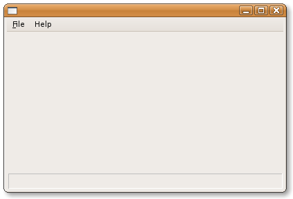
After the wizard generates project you should be able to compile and run it. The application should look like this:
Few words about available sizers
As in previous tutorial we will focus on sizers to layout our window. Currently we know that sizers are responsible for automatically setting position and size of some components. But how they do that? Well it depends on which sizer has been used. The genric rule is that sizer tries to use all it's available space and place managed components in such way that they do not overlap. If the area available to sizer is to small, it requests bigger area so you can be sure that all components will be placed on the window (unfortunately you can not be sure that the window will be small enough to fit on the screen though so be careful with that). Another rule which should be mentioned here is that sizers automatically set-up the minimum size required by the window. Basically when you edit window using sizers, you should know that you edit the smallest layout and without some tricks, the generated you won't be able to resize window to something smaller.
Next I'll describe sizers available in wxSmith
wxBoxSizer
wxBoxSizer is the most basic sizer available in wxWidgets. It's purpose is to align components in one line - one next to another - either horizontally or vertically. This sizer also tries to keep some proortions between components - for horizontal sizer you can set factors which will keep proportionality of the width and the height of the sizer area will be equal to height of the tallest component. Analogically, vertical sizers heep height proportional and the width will be the widest one.
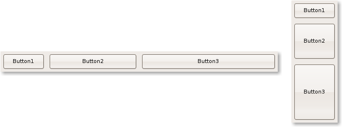
Here are examples of layout using box sizers (the first one is the horizontal one, the second is vertical one):
In that example you may see that all somponents have same width and height. But let's assume that we want the Button2 to be 2 times wider that Button1 and Button3 to be 3 times wider than Button1. This can be easily done by using the Proportion property of managed components. By default the value of all components is set to 1. So if we have 3 buttons, all with proportion equal to 1, it means that they should keep the proportions 1:1:1. If you set Proportion of second button to 2, it would mean that they should keep proportions 1:2:1 (the button in the middle should be 2 times wider/higher than the others). Genreally you can set any value you want here. One of common techniques is to set percentage value there - for example setting proportions to values 20, 30 and 50 would mean that the first button should occupy 20% of the space, the second one should occupy 30% and the third one 50%. The special value 0 means that this item should not be simply skipped in proportion calculations and it will won't automatically adjust it's size.
So if we want to get 1:2:3 proportions, we set 1 for Button1, 2 for Button2 and 3 for Button3. And here are the results:
Also note that if you create resizable window and resize it, those 3 buttons will automatically grow and keep proportions (when you set Proportion to 0, such item won't grow).
The other dimension which is not controlled by Proportion property may be controlled using "Expand" and "Shaped" properties. They are simple checkbockses. If you check the first one, the item will expand it's width/height and will get the size of the biggest item managed by the same sizer. Selecting "Shaped" will also make the item resize but such item will try to keep the initial proportion between width and height so it don't have to use all the space. The effect of "Expand" and "Shaped" properties can be seen when items differ in width/height, here's the example:
In this examples, the first button is the one that has the biggest size of all three buttons. It's size will be used to adjust sizes of other buttons. The second one has "Expand" flag enabled and the third one does not. What can be seen here is that the third button did expand only in one dimension (the one managed by "Proportion" property), the second dimension was left untouched.
You may also note that when item does not fit the entire area, it is centered. That's default behavior which can be changed. In properties of components managed by sizer you will find properties called Horizontal align and Vertical align. Using these properties you can select where the item should be located when it's smaller that it's available area.
wxStaticBoxSize
This sizer is simillar to wxBoxSizer with one exception: it adds extra static box around managed items:


