WxSmith tutorial: Building more complex window
Building a More Complex Window
In this tutorial, we will build a moderately complex form or window. Most of the complexity comes from the use of sizers, but their use is the key to making the same program work nicely on multiple operating systems. Although the process may look complicated when you are new to wxSmith, after writing a few applications you will probably easily build resources with at least this much complexity, so don't get scared. I work with wxSmith almost every day; that's the best way to find bugs and to get ideas for improvements. As it's creator, that's my job. Although the process may look complex at first, I can assure you that you can quickly get the hang of it.
As I'm writing the beginning of this tutorial, I'm also beginning to write the application to illustrate it. I'll describe what I do as I go. Probably I'll make a mistake or two or at least forget to set some property, so the window won't work quite right. We'll learn to recognize the causes of certain misbehaviors of the window and to fix the problems.
We will start with an empty frame - if you have read the previous tutorials you should be able to create one without problems. (Don't forget to put in the Close() statement.)
My idea for an example is something to manage a collection of CD-ROMs. Lest you be disappointed, let me say at the outset that we will develop only the form for the main window of the program; we will not do any database programming to make the application actually work. So what should the main window look like? On the left side of the window, I want to have a list of CD-ROMs. When I click on one, I want details about that CD to show up on the right side of the window. So basically we have two regions in our window: one with the list and one with the details of the CD selected from the list.
I will use sizers because the application should run on various platforms – Linux, Mac OS X, or MS Windows – without any re-writing and the main window should be resizable. That is, as the user changes the size of the main window, the size of the space available for the list should change and the spacing of the items in the details should adjust to make an aesthetically pleasing window.
Building the skeleton
In the first tutorial, we added an extra wxPanel into the frame to make the background better. Let's do the same thing here:
- First add a wxBoxSizer directly into the window
- Add a wxPanel into that sizer
- Set the size of border to 0 to make the panel cover the entire window.
Now we should have this result:
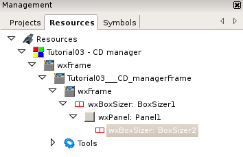
Now let's add a wxBoxSizer into the panel. This sizer will manage our two main regions. After that sizer is added, the tree structure should look like this:
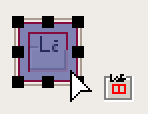
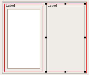
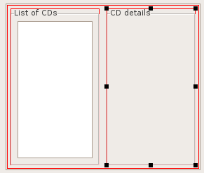
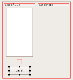
Now we can start filling those two regions - each one can have only one component in it – but we want a number of them. So what do we do? We put one sizer in each region, and then we can put a number of items in each sizer. In such situations I usually use a wxStaticBoxSizer because in it we can name the region. So let's add two wxStaticBoxSizer-s into the window, one into each region. Be careful while adding the second one lest you add it into the first region. To add the second sizer properly, you must click on the border surrounding the first one, as in the picture. Remember that the parent for a new item is always the item totally covered with blue. The screen should look like this when you drop the second sizer:
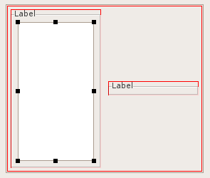
The window is small now, but it will change when we will add some components into the regions.
Building the List of CDs region: Orientation, Proportion, Expansion
Now let's add some components items which will show a list of CDs. We can use a wxListBox here:
The list is rather small so let's resize it using drag-handles to something wider and higher:
That's progress, but the second sizer did not resize. That tells us that we didn't turn on its Expand flag. To do this, click on the second sizer and check its Expand property:
Now we can change the labels of the regions since they are fully visible now. To do this, click on each region's sizer and change the Label property:
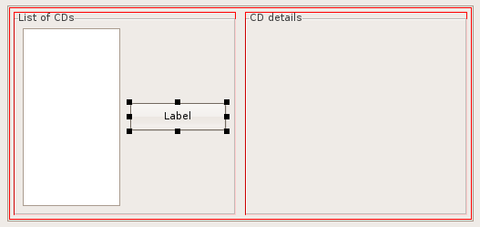
We would like to have the ability to add a CD and delete a selected CD, so we will insert two buttons for this purpose into the left region. To add a button, click on it on the Standard tab and then add it into the sizer. Note that wxSmith will not let us (erroneously) select the wxListBox as a place to put the button; the ListBox cannot have children, so wxSmith will try to add new items before it or after it. After adding the button we would have such a result:
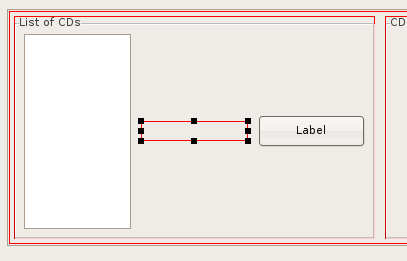
Hmm, I want the button to be under the list, not next to it. The wxStaticBoxSizer aligned components as we had told it to do; by default it aligns them in a horizontal line. To change the direction to vertical, you can change the Orientation property of wxStaticBoxSizer. But before we change it let's anticipate one more thing. I would like to have two buttons instead of only one and I'd like them to be aligned horizontally. Since wxStaticBox will be changed to vertical mode, we will have to use yet another sizer just for the buttons. So let's add a wxBoxSizer right after the list and before the button:
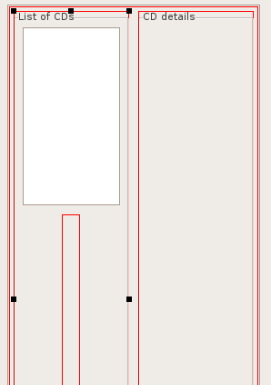
Now let's change the Orientation of the wxStaticBoxSizer to vertical. After changing we have following result:
We can see that something is badly wrong here. The wxBoxSizer is abnormally stretched; and if we scroll the editor, we can see that the same goes for the button. We said in a previous tutorial that wxBoxSizer and wxStaticBoxSizer are trying to keep everything the same size in one direction. That is exactly what happened here. wxStaticBoxSizer used the tallest item (the list of CDs) and applied this height into all managed items. How can we disable this behavior? By setting the Proportion property of both wxBoxSizer and wxButton to 0. This will notify the sizer that those items shouldn't be used in height calculations:
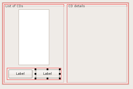
Now let's move the button into the wxBoxSizer - you can very easily do it by clicking on the button and dragging it into the sizer. After that we can add the second button next to the first one:
Now we can see that the list doesn't have the Expand property set (otherwise it would be almost as wide as the region. Go back and check it.
Now I'd like to see how resource currently looks in the application. We could by simply running it (F9) or by pressing the preview button on the right part of the wxSmith editor:
(If you run the application you will see that there's a menu and statusbar. On the preview they won't show up; wxSmith still misses a few features.
Our window looks good, not perfect but let's leave some polishing for later and fill the CD details region.
The CD details region: wxFlexGridSizer, wxChoice, wxDatePickerCtrl
Inside CD details I'd like to have a description of the CD:
- Type (Music/Program/Backup/Other)
- Title
- Artist/Author
- Date of release
- Description
For such a list we would need some type of grid sizer. Ok, but the region has a wxStaticBoxSizer which aligns items only in one line. To overcome this limitation we can just add another sizer into the wxStaticBoxSizer and use the new one as the grid. From the two available sizers I suggest wxFlexGridSizer (wxGridSizer would force all cells to have same size which wouldn't look good because the row with descriptions may need some more space than the others). So let's add the new sizer:
- Add wxFlexGridSizer into wxStaticBoxSizer
- Check the Expand property of the new item
- Set Border Size to 0 to avoid some unwanted border.
Data presented here should be shown in two columns - the first for the label and the second for the value, so let's change the Cols property to 2. And now it's time to add the content. For labels we will use wxStaticText and for the value we will use different items:
- wxChoice for Type
- wxTextCtrl for Title, Artist/Author and Description
- wxDatePickerCtrl for Date of release
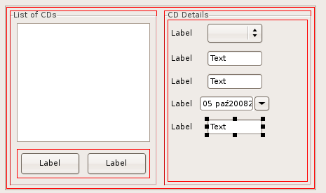
After adding the items we should have the following view:
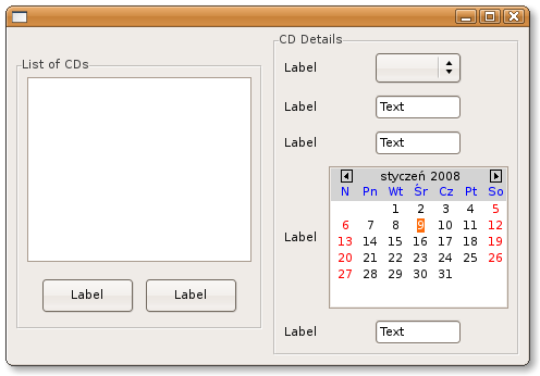
(Back in 2006, BYO had problems with wxDatePickerCtrl and had to replace it with wxCalendarCtrl. By the time of this revision in 2012, there was no problem. Clicking on this control drops down a calendar so the window looks rather similar to what wxCalendarCtrl gives. The remaining illustrations are BYO's using wxCalendarCtrl.)
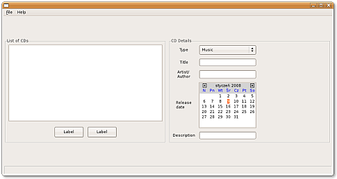
Now when we build and run we have this screen:
It looks like we have a few things to do now:
- First is to check the Expand property for the first region since (it didn't expand when the second region increased height)
- Second is to set proper labels for values in the CD details region
- Third is to check the Expand property for all items with values in that region
- Fourth is to adjust items used to edit values in CD details region
The first three tasks are quite easy and I'll leave them to you.
The fourth task will require a few new things so I'll describe it better:
First let's remove the word "text" from text boxes - it's set by default but it would be better to have empty text by default. Text can be changed by modifying the Text property so you should do this very quickly.
Now we have to set some values which could be chosen from the wxChoice control labeled Type. It is done by editing the items in the Choices property of wxChoice. On that line, there's a button on the right side. When you click it, a new window will pop-up where you can enter choices:
Music
Program
Backup
Other
Making a Window Resize
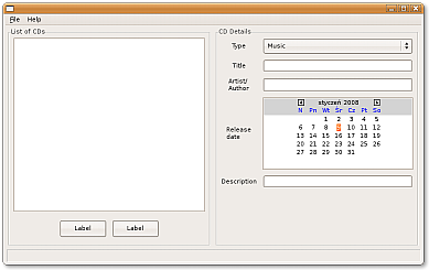
We have the first version of our window. But it's not the end of our work. If we want it to be user-friendly, it should be able to resize. We can check it by either showing the preview or building and running the application. The latter route is more reliable, so let's use it. When I tried resizing it, it looked like this:
We can see two wrong things in this window:
- The regions did not expand vertically and stay centered
- The content of the second region did not react for the resize
The first problem should be caused by some missing Expand property so let's find it.
First we should check if the regions have the Expand property set; yes, they do, so this is not the problem. Generally in such situations we should continue checking in the parent item. In this case it is a wxBoxSizer which always expands. Next there is a wxPanel, which we used to make a nice background, and voilà: this one is missing the Expand property. So let's check it and test the result again. It works fine.
Now the second issue. Content inside the CD details pane was based on wxFlexGridSizer. If you look into the previous tutorial you may find out that this sizer has a special property called Growable cols. Using this property we can set columns which should resize. I'd like the column with values to grow; we don't need more space for labels. So let's set Growable cols to "1" (indexes are 0-based). Note that you may quickly find the wxFlexGridSizer by looking into the resource tree - we have only one such sizer in our project.
Now we have a better result:
Finishing Touches
As I look at our window, I see that I left undone a few things in the first region. The buttons don't have new labels, and there's to much space between them and the list, so we can update those things right now.
As usual I'll leave changing the Labels to you - those buttons should be called Add and Delete.
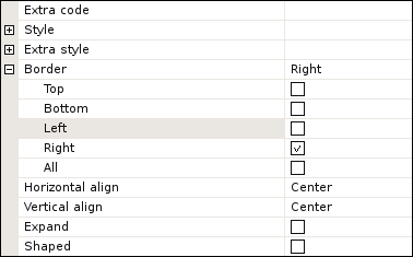
Now let's remove the wasted space. The space is added because each item inside a sizer may have an extra border. By default it's set to 5 pixels, so if we remove the border around buttons we would have more free space. But then the buttons won't have any space between them.
To overcome this problem we could use another property related to Border and also called Border but distinguished by a little square in the left margin. In the square is + mark. By clicking on the + we expand the line and can then check the borders we do not want. So if we remove the top/bottom/left edge borders of the first button and the top/bottom/right edge borders of the second button we remove the extra space but the buttons will still have some gap between them. Here is how the property should look for the first button:
Here we reach the end of this tutorial. Of course the window we've built need not be it's final version. For example, we could add a list to record who borrowed the CD from us and when and who has it now. We could add some searching and so on. But this tutorial has gone on long enough, and I'll leave those upgrades to you. I hope that you've learned something new, interesting and useful here.
