WxSmith tutorial: Hello world
"Hello world" Tutorial
Hi, in this tutorial we will write a very basic application that will use wxSmith(which is a smart tool for GUI design), called "Hello world". "Hello World" is the traditional first program for many computer languages so in keeping with this time honored tradition, it should be your first step in learning wxSmith.
Before we start you will have to either compile wxWidgets or download precompiled binaries and header files. These steps are described on the wiki pages below:
- windows user see the wiki page:Compiling wxWidgets 2.6.2 to develop Code::Blocks (MSW) or Installing Code::Blocks from source on Windowsor WxWindowsQuickRef. There are two method to install the wxWidgets libraries, one is you can download the wxWidgets source and compile your self. The other is you can download the wxPack from [1], then install it, the wxPack will give a pre-compiled wxWidgets library, so you can save a lot of time.
The most important thing is that you have get the wxWidgets ready working with code::blocks. Now, let's make some project :)
Creating wxWidgets project
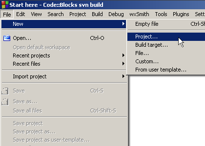
The easiest and the preferred way is to create wxWidgets project using project wizard. It stars like creating any other project using New project menu:
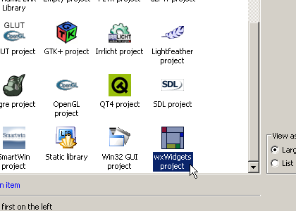
Then to create wxWidgets application, let's choose wxWidgets icon:
After you click "Go" button, Code::Blocks will bring up the wizard window. It consist of several pages where you can enter some options for your project. I'll describe few pages better since they may cause problems for new users.
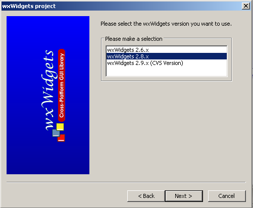
At the very beginning the wizard asks you which version of wxWidgets you want to use:
The best option for now is to use wxWidgets 2.8.x since it is stable and has few features not present in wxWidgets 2.6.x series. Also wxSmith aims to provide support for latest stable version of wxWidgets.
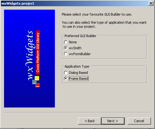
On another wizard page you choose what GUI designer will be used and what type of application should be generated:
If you want your application to work with wxSmith check the wxSmith designer option. You also have available the check box for the wxFormBuilder, although this program is not covered in the tutorials presented here. The other option let's you choose whether your application will be created using wxFrame or wxDialog. Both options will lead to a valid wxWidgets application but wxFrame is the preferred choice since it's a more common usage of wxWidgets and the wxDialog-based applications are not as flexible as wxFrame-based applications.
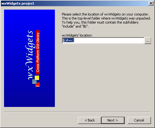
On another page you may choose the location of your wxWidgets library:
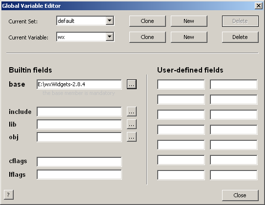
You can choose real directory here, but that may lead to problems when your project should also compile on other computers. Another choice is to use Global Variable system ( to open the dialog below or modify or change this global variable, you should click on the menu Settings->Global variables) available in Code::Blocks.
When you use it, the location of wxWidgets library is read from such variable. This mean that wxWidgets directory is not hard-coded inside your project, but is stored inside global configuration of Code::Blocks. When your project will be opened on other computer, it will use it's configuration. The easiest option to use global variable is to leave $(#wx) what means to use global variable named wx. This name is reserved for wxWidgets and should be chosen in most cases.
When you use global variable for the first time, it will ask for wxWidgets directory. The only thing you need to do here is to enter valid location in base field. This is required only for the first time since Code::Blocks will automatically use this setting for other projects you create.
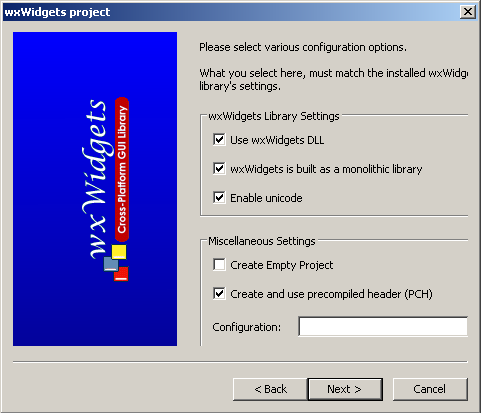
On the next step, wizard will ask you for configuration of wxWidgets library. Since wxWidgets may be compiled differently, each compilation type should also be threated differently inside your project. This step may be little bit confusing for new users since it require some knowledge about build process of wxWidgets. But if you used wiki pages that I've put at the beginning of this tutorial to compile wxWidgets, set your configuration to this one:
Here is a brief explanation of these options
- use wxWidgets DLL : If checked, when you create an executable file, it link to wxWidgets dynamic link library, So, your exe file should run with some wxWidgets DLL files. If unchecked, your executable file's size will be larger, but it can run without wxWidgets DLL's support.
- wxWidgets is built as monolithic library : If checked, your target build file will link to the monolithic library of wxWidgets. see WxWindowsQuickRef#wxWidgets_Build_Options_Explained for more details.
- Enable unicode : If your program will support some international language other than English, such Chinese, Japanese, you can check on this option.
- Create and use precompiled header(PCH) : It will speed up building your program. see PCH for more details.Note that I've also checked the option to use precompiled headers (PCH) since it can really speed-up the compilation of wxWidgets applications on some compilers (especially GCC).
When you follow another wizard pages, you may occasionally see message box saying that debug configuration can not be found. This is because the wxWidgets library was build using release mode (the BUILD=release option used for make). If you want real debug library, you can recompile your wxWidgets by using BUILD=debug. Project may also be tuned to work with release version on both debug and release build targets (the way to do this is presented at the end of this tutorial).
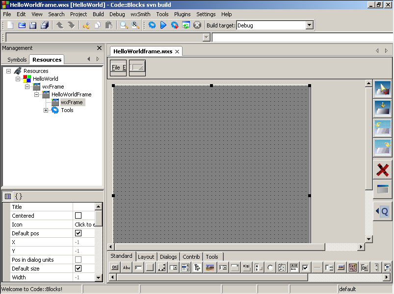
After project is created and initialized properly, Code::Blocks will look like this:
Now when you select Release build target and press Compile, it should create wxWidgets application. But before you run it, you will probably need to copy wxWidgets dlls (from lib\gcc_dll inside directory where your copy of wxWidgets resides) to project's directory. When your application is ready and runs without problems, we can jump to the next point.
Let's add some fireworks
Now it's time to fill the empty frame with some "Hello World" message. This text could be added directly into frame, just like in most commercial GUI designers. But we will learn to use sizers. But what's that?
If you have been working with java you will remember something called Layout managers. Implementation in wxWidgets differs a little bit but it does almost the same.
Ok, but let's put some explanation here: Usually when adding items into windows you must specify the item's position and size. wxWidgets tries to automate this process and it uses sizers for that. They are automatically positioning and sizing window items and they can also set the size of window to fit all items inside. Sizers have one big advantage. When you write cross-platform applications, you cannot assume that fonts, buttons, etc. are sized the same on different operating systems. This can even occur on the same platform when using window themes. When you use sizers, you don't have to worry about that. All sizing is done automatically. And one more thing - sizers can even reposition and resize window items when the main window changes size.
Now since we have some background knowledge, it's time to add something.
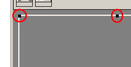
When you look at the wxSmith editor, you'll notice that the area of window is surrounded by eight black boxes.
These black boxes are surrounding a currently selected item. In our case it's a whole window. Adding new item is simply done by clicking on one of the buttons in the palette at the bottom of the editor and then clicking some position on the resource.
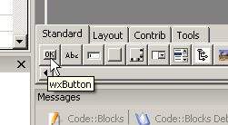
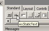
As you can see here, when you keep your mouse cursor over a component, it will show it's name. That may help to find items when you're not familliar with their icons.
Let's add new wxPanel component to our window - this is fourth icon from the left. You may see that when you click the wxPanel item and then move cursor over the resource, some part of the editor will change colour. That's intentional and used to show onto which part of resource new item will be added.
After wxPanel is ready you will notice that the background colour of window changed to light gray. Now our window will look much more like other windows. Note that currently the selection changed into added panel but since it's size is equal to frame, it's hard to find out what's really selected. To make sure that wxPanel is selected, click somewhere on light gray area of our window (Note to Linux users: wxFrame and wxPanel usually have same background so it may look like nothing has changed, you may ensure that there's wxPanel by looking into resource browser).
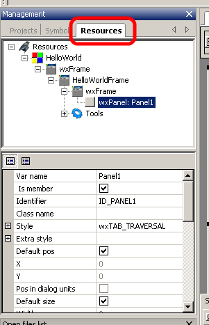
If you want to see the selection exactly or select items that overlap, you can use resource browser. To show it, click on resources tab located in same place where project browser is:
Resource tab consists of two parts. First is resource tree which shows structure of resource and second one is property browser which is common in GUI designers. Inside resource tree you can find currently selected item. In our case it is wxPanel class we added before. Selected item also shows the name of this item: Panel1. This name is basically the variable which can be used to access this component in your code.
We added new item by selecting the place for new item. This is the default wxSmith's behavior. However, there is other mode of adding items. In this mode, new item is added right after you click on palette's button. The position of new item is relative to current selection - just like cursor in text editors. Basically we can add new item into three different positions relative to selection:
- Before the selected widget
- After the selected widget
- Into the selected widget.
This can be changed by clicking one of four "placement" buttons on the right side of editor:
The upper most is the mode we used - "point by mouse", next one means "add into", following is "add before", and the last one means "add after". Current mode is spotted with red check mark on the button. Sometimes few selection modes are disabled. This means that they are not valid for currently selected item. For example you can not add any item into wxButton component since wxWidgets declares it as the one that can not have child items. And when the main component (the window) is selected, you won't be able to add anything after it or before it.
Now let's assume that we've made a mistake and want to delete item that we have just added. In fact we have a small mistake and will have to delete wxPanel. To this, click on the red X button:
When you click this button, it deletes current selection, so if the panel didn't disappear, make sure it's selected and click the button again. Now we should return to the state at the beginning.
The mistake made here is that we've added wxPanel directly into main frame. But as I've said before, we will be using sizers to manage window's content. To use sizers, first we have to add sizer into main frame and then add wxPanel into it.
Sizers are available in the Layout tab on the palette. Switch to it and select wxBoxSizer:
This sizer tries to position items in one line, either horizontal or vertical. Horizontal is by default and we will use this.
After adding sizer, two things have changed. First is that our window has now red border. This mean that there's sizer attached to it. When you look into resource browser you will also see that sizer has been added (you may need to click on the editor area to refresh the selection on resource browser). Second thing is that size of window has shrinked to small box. That's correct since sizer is also responsible for resizing items.
Now let's add wxPanel. Make sure that we will add it into sizer, not main frame. After we do this, you will see something like this:
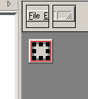
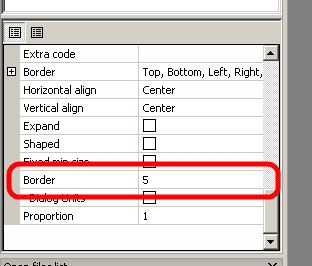
Here we can see our panel surrounded by drag boxes. There's also some dark gray border around it (it won't be visible on Linux). Each item added into sizer can be surrounded by such border. It's useful when you want to have spacing between items. But in our case we should get rid of it to get more proper window. To do so, we will have to change property inside property browser. Search the border size and change it to 0:
Now when we have our panel adjusted, we can finally add "Hello world" text. Since we will also use sizers to manage items added into wxPanel, we have to repeat addition of wxBoxSizer into wxPanel. After sizer is on it's place, switch back into Standard tab on the palette and add wxStaticText:
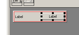
Because this text looks so lonely, let's add button next to it by clicking on wxButton. Note that if you still have "point by mouse" insertion mode turned on, half of wxStaticText item will be coloured in light blue when you put mouse over it. This is a hint for you: when the left half of text is highlighted, new item will be added before it, and when the right half is highlighted, it will be added after the text. So let's add button after the text.
Now we should have this content:
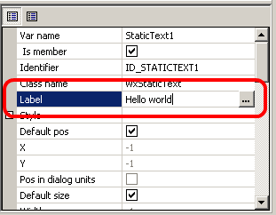
Now let's finally set our "Hello world" text. wxStaticText control which we added before has "Label" text on it. It is default text set to all newly created wxStaticText classes. We will change it using property browser similarly to changing border size in wxPanel class. To do it select our text first, find Label property and change it to "Hello world":
You can also set multi line text by clicking on "..." button or putting "\n" inside text (just like in c strings).
Let's react - making close button
Now let's do something with the button. Since buttons usually react when somebody clicks them, let's make it close the window. First thing we should do is to change text shown on button to notify user about function assigned to it. It is done just like in case of text - select button, find "Label" property and set it to "Close" (or anything you want ;) ).
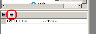
Second thing is to assign event handler to this button. Basically event handlers are function which are called when some "event" occurs. In our case instead of "event" we could say "click on button" because that we want to process. As many GUI designer, wxSmith can automatically generate such handlers. They are accessed through property browser just like other properties. To switch to events you have to click second icon at the top of property browser (don't worry, those icons are going to change to something more self-explanatory):
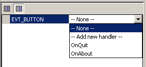
After you click on this icon, you will see all events supported by currently selected item. wxButton class support only EVT_BUTTON event so only this one is shown. When you click on this event and expand combo box you will see available options and handlers for this event:
When you select -- None -- there won't be handler function automatically assigned to this event (it may always be set manually), selecting -- Add new handler -- will generate new handler function. Below are shown other event handlers known to wxSmith which can be assigned to this event. We can see here OnQuit and OnAbout. Those handlers were created by wizard. So let's create new handler. We could use one of those defined, but since we haven't looked into source code yet, we don't know what they do. After you select new handler option, you will be asked for name of handler. This is simply name of function which will be called as a reaction for event.
When you enter new handler name, wxSmith will generate new handler function, open file with proper source code and put cursor inside handler function (note that you may need to press up or down cursor to show the line with cursor). Note that this function is member of class called for example HelloWorldFrame. wxSmith creates one such class for each resource. Since event handler function is member of this class, you have access to all the window from it. So when we want to close our window we just call Close function:
After compiling our project it will show our "Hello world" and "Close" button.
This is end of this tutorial, I hope that it showed some basics of wxSmith. If you have any problems with it or think that some parts are unclear, please contact me (byo) on forum.
